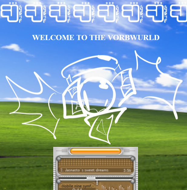
no style? no future
VORBNET citrus update and hiatus megablog
sorry for the long wait (p_p)
yay the sites finally done* after over a year since the last major update!!

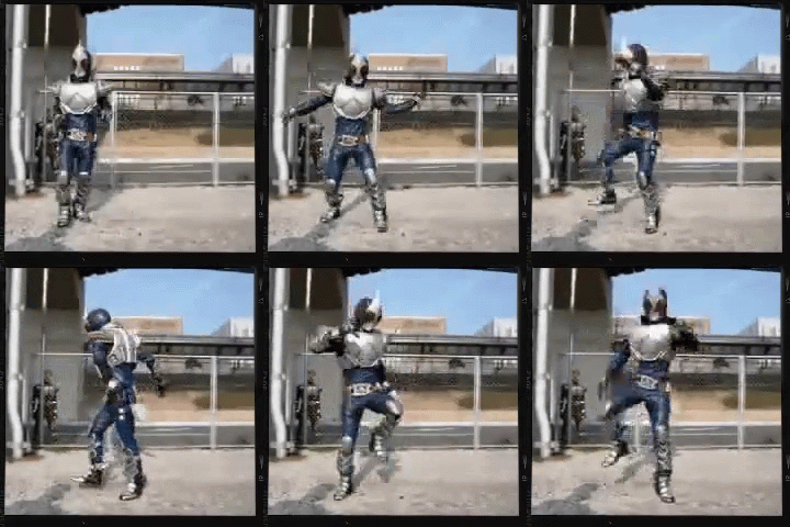
Kamen Rider Blade
WHERE TF WAS I W/ THIS SITE????
short answer: brainstorming and failed attempts.
long answer:

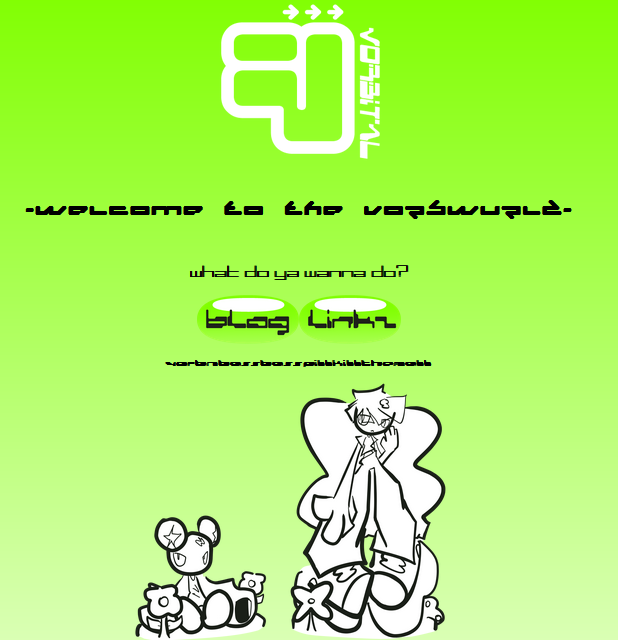
old vorbnet (circa febuary 2023)
once upon a time i had this website around 2023.
For the longest time ive had an obsession w/ websites and always wanted to have my own, so once i learned about neocities i learned html and whipped up the first version of the site.
for my very first site its decent but was VERY barebones.
more old vorbnet
even though it was really basic it was pretty much all i needed for a while.
but eventually i wanted to do more.

vorbnet maintenance page (circa march 2023)
yea bitch we locked in
so yea i quickly realized that the old site wasnt gonna be work the way it was. so i put up a quick maintenance page and began to work.
i decided the main style of the site to be based around frutiger metro since it's messey but colorful style would fit the site.
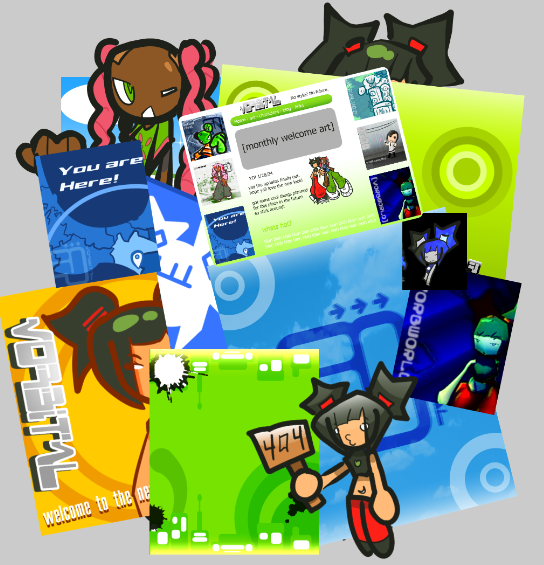
from early october early december i was working away on backgrounds, fake ads, layouts, character renders for bios, and more.

a collection of just a handful of vorbnet stuff
I would show you what it ended up looking like in the end but uh
I HAD NO IDEA WHAT I WANTED THE SITE TO LOOK LIKE
ok like i at least knew what the main page would look like but it was a huge mess for everything else and would be very challenging for me to code something THIS ambitious at once.
so because this would be too big to code before early 2024 i decided to eventually scrap this concept and go for something more simple.

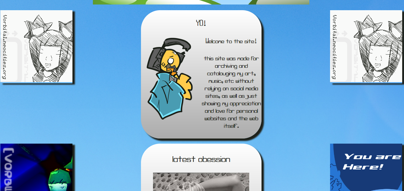
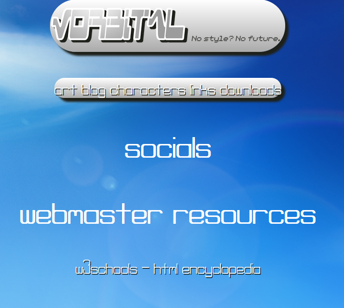
vorbnet (circa july 2023)
this one ended up sticking for a while (for better or worse lmao) and tbh i really dont have much to say abt it. i guess its just a half step from the original site.
hey so you know how i just said that i didnt know what the site would look like and how there wasn't a real page due to that
well that was kind of a lie

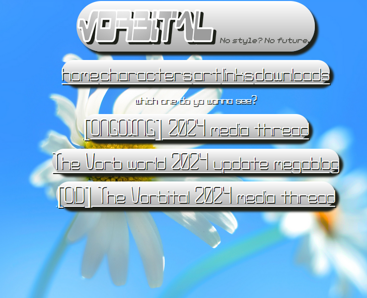
vorbnet update (circa november 2023)
with a couple of the graphics from the march 2023 attempt, more knowledge on html, and a shit ton of old windows wallpapers, i tried finish the site once again.
honestly this attempt was prob the closest i got to actually getting it done. over half of the site was done w/ a downloads page, character bios and everything.
more vorbnet screenshots (circa november 2023)
as much as i was getting very close to completion, i felt like it didn't really matched the vision i had in mind (that and it was really frustrating to code) so i once again scrapped the update.
ok atp ts is getting a little repetitive so i'll just speed it up
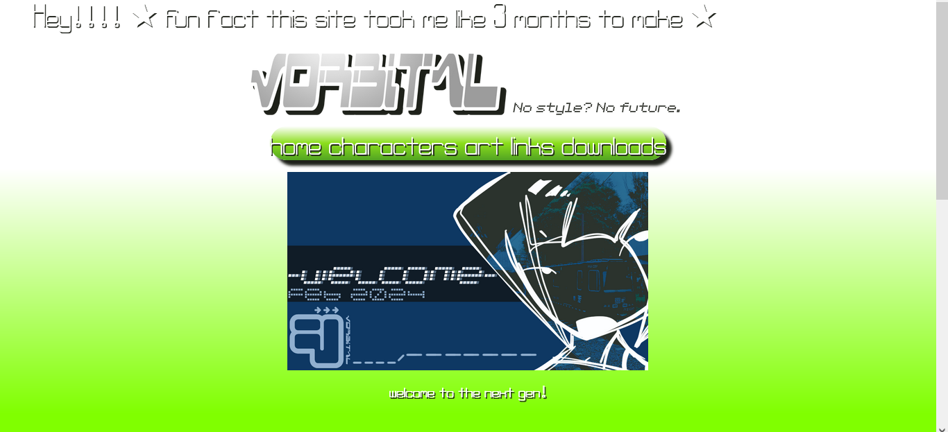
so i tried again in feb 2024 to give the site an overhaul but the thing about this site is that it was actually in a releasable state with only 2 unfinished pages left

vorbnet (circa febuary 2024)
but again it took long to code and wasnt close to my vision and this time i was so numb from trying to do this 4 times that i just ended up trashing the update once again (thankfully one last time).
ok so after doing art fight in july i didn't really have anything else to do, and while thinking abt what to do i literally just went

so on late june 2024 i decided to try redesigning the site one more time.
BUT FIRST
i needed some ground rules
- MAKE THE LAYOUT SIMPLE AS POSSIBLE TO CODE FOR
- make that same layout consistent for all pages
- only make the most nescessary pages for launch
so with that in mind i started with a different approach to the other updates; focusing more on planning and concept art rather than just jumping into coding and hoping for the best.
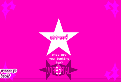
vorbnet citrus hub and error concept art
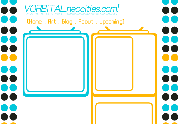
with the concept art i tried to go more into a cutesy and simple direction inspired by plus tech squeezebox and orange lounge.
the error page (right) did make the cut but as i was coding the mainpage i started to feel like the concept art was lacking personality and looked too cluttured.
so obviously i had to make it cooler.

vorbnet citrus hub concept art 2
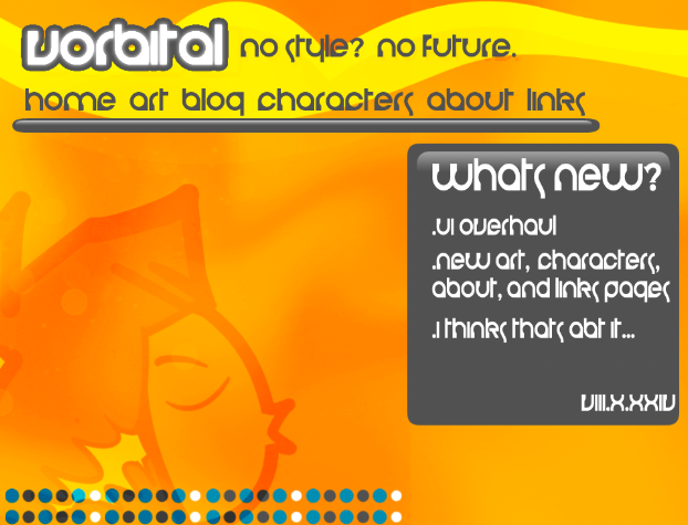
inspired by the old website for perfume, this is what ended up being the normal layout for the website (and what you're seeing right now!)
so yea thats abt it. so glad i finally turned the site into something im proud of. and even though it took me a while, i'd honestly say that it was worth it.
*theres still way more stuff i wanna add onto the site but for the most part it's done :]
[](O/\/\o)[]


